
A Bullet Journal is the perfect way to sort my thoughts and goals with a bit of creative flair!
This year, I am taking inspiration from the Tarot Deck.
It’s April, and the weather is going crazy. I know that springs are always a little hectic, but fluctuating between a high of 30 and a high of 70 feels like a bit of a stretch. We also got a tornado warning, actively telling us to take shelter! There have been tornadoes in the past, but the frequency of the storms feels like they are getting closer and closer. Spring always reminds me that water is not an element to be trifled with.

This year has been strange. I feel like I am constantly running to the finish line, only for it to move that much further from me. Or maybe I’m running on soap. I want to get ahead, but I just cannot find the momentum to do so. Honestly, my journal is sometimes the only thing that keeps me moving forward.
I don’t know if I could tell the days of the week apart without it. My brain categorized the week into two days: workday and non-workday. I can get through the workday, but I want to do so much that I get overwhelmed and do nothing. The best way to combat this is with a bullet journal. For me, at least. Writing down the tasks makes them more concrete and easier to process.
Explore the Craft section of MCG for exciting patterns in knits & knots or unique creations in the stitchery. Don’t miss the extensive collection of bullet journal designs to inspire your creativity!
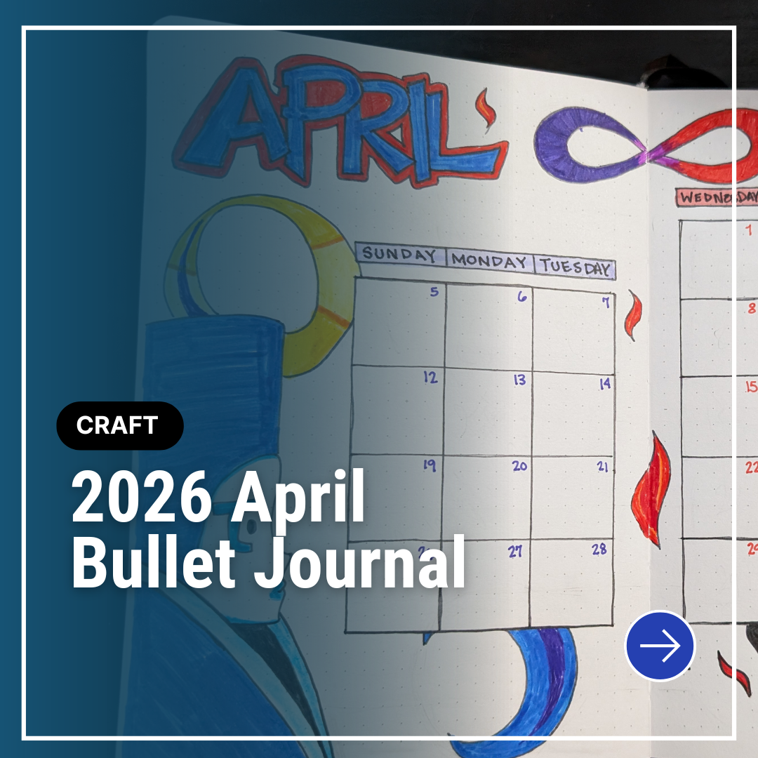
The Persona 3 game starts having tarots associated with each month in April. So it felt fitting to do the one and two major arcana for this month. The Magician and the High Priestess. Once again, I started by outlining the calendar and working where there were empty spaces. The top left of the page has the most horizontal space, and the left of the page has the vertical.


The title of the month is the priority of the horizontal space. We’re still in the short letter months, but I know I will be taxed for space as time goes on. The High Priestess cards I referenced had an image of a figure. I was drawn to the one from the Persona 3 deck. But it made sense to place her in that vertical space. And if the high priestess is on the left, then the magician should be on the right.
Continuing with the Persona 3 inspiration, I placed the magician’s hand and flame on the bottom of the page with the eyes on the top. It turned out a little disjoint, but I think I still like it. The flame, having some separate flames, felt like a good thing to continue up the page, so I carried the sparks throughout the right side. I also took the infinity symbol from the magician card and placed it at the top, going through both pages.


Fire feels like a very red color. While there are a lot of different colored flames, red felt appropriate. And I wanted the high priestess to contrast that, so I went for the classic combo of red and blue. Having the left side embody blue while the right side embodied red gave an interesting aesthetic that flowed together for me.
Habit Tracking
I haven’t really been doing my habits lately, besides the core self-care ones. That lies squarely with me. But, in order not to blame myself too much, I decided to blame something else. Pokopia. Pokopia is a game about creating homes for Pokémon. That’s it really… But considering I played Animal Crossing for around two thousand hours, it’s no surprise that I am entranced by the game.
One thing I realized is how schedule-dependent I am. If I have a set time period to do a thing, I will follow it well and be a relatively productive person.
When I don’t have that, I become a couch potato and play until I’m told the next scheduled thing is happening. Which is usually going to bed. Realizing this, I want to spend the rest of April with more time blocked out for specific activities in order to accomplish my habits.
Using Color
One thing I noticed about my journal is that I use a lot of black. Black is my go-to for outlining and for writing down tasks. But that’s no fun! Since I do like the clean look of having my tasks written in black, I decided to do some of the outlines in more colors. And I really do think it makes a difference. It brightens the page in a way that I wasn’t expecting, but I absolutely adore!


Leave a Reply